If you’ve been wondering how to increase landing page conversions, the answer might be simpler than you think. The harsh truth is that most landing pages underperform, quietly leaking leads and revenue every single day.
What many businesses dismiss as “good enough” often masks costly inefficiencies. Even small, strategic tweaks can dramatically boost performance, without spending money on redesigning or increasing the ad spend.
Quick Stats:
Improved UX design could increase conversion rates by up to 400%. (Hostinger)
What does this mean for you?
It means your landing page could already be profitable, but not optimized. Every 1% improvement in your conversion rate represents real leads, real revenue, and real growth, without spending a single extra dollar on ads.
We will walk through eight proven hacks you can implement today to boost your landing page’s performance.
Let’s start with the first one.
Table of Contents
ToggleTL;DR Key Takeaways
- Most landing pages convert only 2–6% of visitors, meaning small tweaks can unlock big revenue gains.
- Place your form above the fold — visibility drives immediate action.
- Use clear, benefit-driven headlines instead of vague CTAs like “Get Started.”
- Optimize for mobile — over 60% of traffic comes from smartphones.
- Embed forms directly on the page; avoid pop-ups that break user flow.
- Ask for fewer details (email + first name max) and enable autofill for faster submissions.
- Add social proof below the form — short testimonials boost trust and conversions.
- Upsell on your thank-you page with a low-ticket offer to recover ad spend.
- Test one hack at a time, measure results, and keep iterating.
- A 1% conversion lift can mean thousands in added revenue.
Start Optimizing today.
8 Proven Hacks To Increase Landing Page Conversions
Now that you understand why optimizing your landing page isn’t just a design choice but a strategic growth move, it’s time to get practical.
You don’t need complex tools or a complete rebuild to see meaningful results—just smart, evidence-backed adjustments that influence how users behave on your page.
Below are eight proven hacks that leading marketers, CRO experts, and performance strategists use to increase landing page conversions consistently.
Let’s start with one of the simplest yet most impactful changes you can make today.
Move Your Form Above the Fold
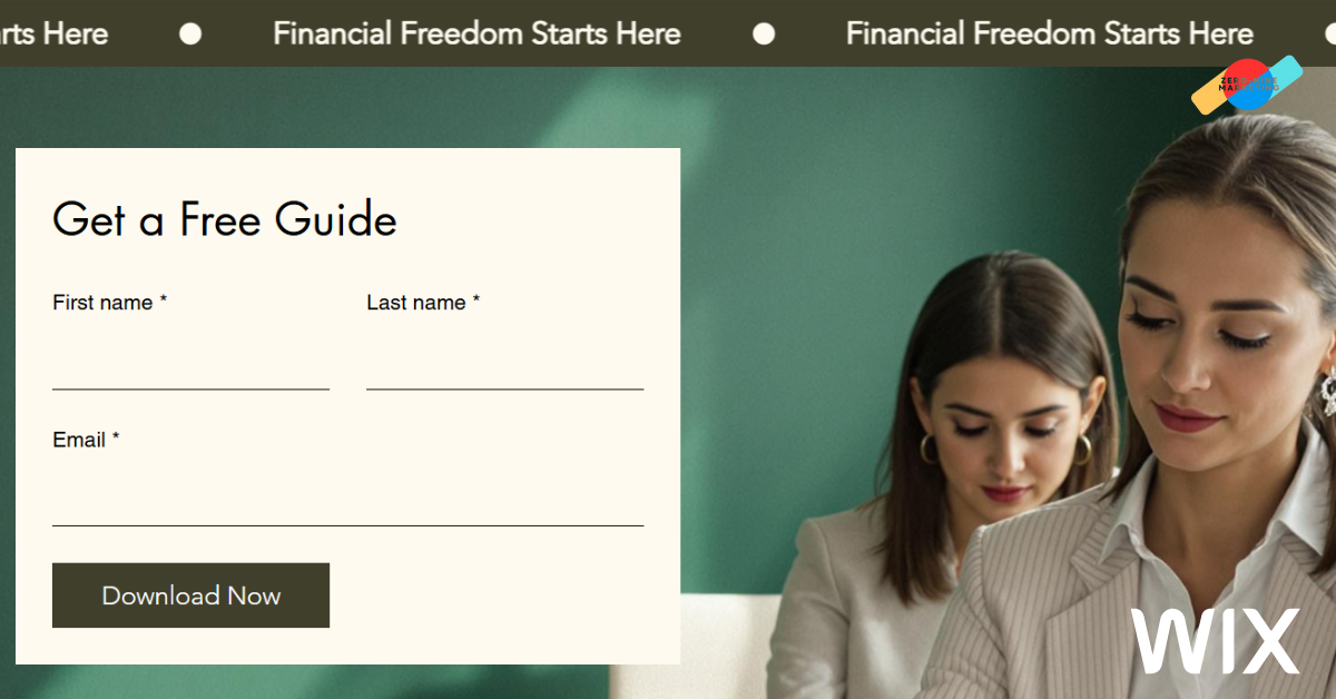
If your visitors have to scroll to find your form, you’ve already lost them. Visibility equals opportunity. Your form placement directly determines how quickly a visitor takes action.
Quick Stats:
Studies show that the attention of visitors spans onscreen is under a minute, and 50% of users no longer bother to scroll. (ContentSquare)
Your landing page’s purpose is not to tell a long story. It is to convert interest into action. When someone clicks on your ad or email, they already know why they’re there. Don’t make them hunt for the next step.
Here’s how to fix it effectively:
- Position the form in the first visible section. Place it right below the headline and sub-headline, where users instinctively look next.
- Keep the form concise. If you need additional fields, consider using a multi-step form instead of overwhelming visitors at once.
- Design for both desktop and mobile. A form that looks perfect on a wide screen might push below the fold on mobile—test across devices.
- Eliminate distractions. The top of your page should have one primary goal is to drive the conversion. Avoid unnecessary navigation or competing CTAs.
By repositioning your form “above the fold,” you remove friction from the user journey and capture intent at its peak. It’s one of the simplest yet most powerful adjustments you can make to increase landing page conversions immediately.
Once your form is visible, the next challenge is clarity. Let’s explore why being clear and not clever in your messaging can make or break your conversion rate.
Be Clear, Not Clever
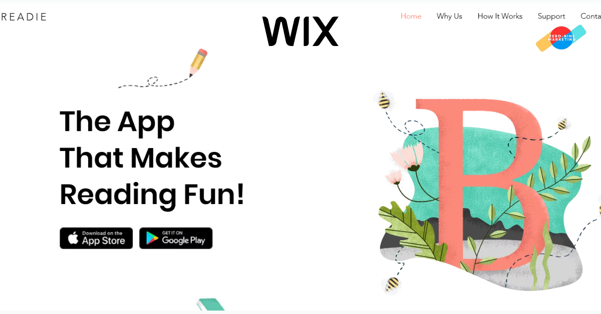
Creativity grabs attention, but clarity drives conversions. One of the most common reasons landing pages fail is that visitors simply don’t understand what’s being offered. A confusing headline or vague CTA can kill momentum faster than any design flaw.
When a visitor lands on your page, they’re subconsciously asking three questions:
- What is this about?
- Is it for me?
- What should I do next?
If your page doesn’t answer these instantly, you’ve lost their attention.
Quick Stats:
A study states that 55% of visitors spend between 15-30 seconds on a webpage, which means your message has to hit home immediately. (CrazyEgg)
Here’s how to simplify your messaging without losing impact:
- Use a direct headline that conveys value. Instead of “Unlock Your Digital Potential,” say “Get More Leads With Targeted Google Ads.”
- Avoid jargon. Speak your audience’s language. If your reader needs to “decode” your copy, you’ve already failed them.
- Reinforce benefits, not features. Visitors care about what’s in it for them, not what your software, course, or service does.
- Support with visual hierarchy. Use bold fonts, contrasting colors, and white space to make your main message unmistakable.
Clarity builds trust. When people instantly understand your offer, they’re far more likely to act. Your landing page doesn’t need to sound “smart”; it needs to sound obvious.
Once your message is clear, it’s time to make it irresistible.
In the next section, let’s explore how to craft high-converting CTAs that trigger immediate action and turn visitors into customers.
Create Irresistible CTAs (Calls-to-Action)
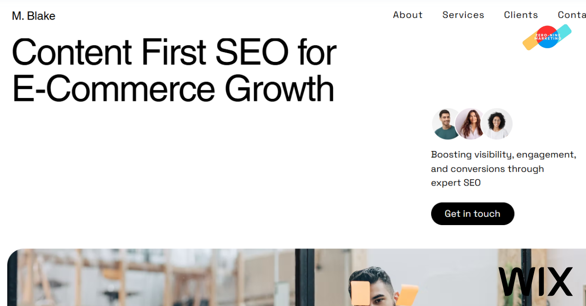
Your Call-to-Action (CTA) is where all the effort on your landing page either pays off—or fails. It’s the moment of truth where attention becomes action.
Yet, most CTAs are bland, generic, and easily ignored. A weak “Submit” button can undo even the best copy and design.
Quick Stats:
Using a specific, clear CTA can increase conversion rates by 161% while increasing the size of the CTA button can increase click-through rates by 90%. (WiserNotify)
The key is to make your CTA clear, action-driven, and emotionally charged, so the user feels compelled to act immediately.
Here’s how to craft CTAs that convert:
- Use action verbs that speak to outcomes. Replace “Submit” or “Click Here” with “Get My Free Quote,” “Start My Trial,” or “Download My Guide.” Each phrase tells users what they gain.
- Add urgency or exclusivity. Phrases like “Limited Spots Left” or “Offer Ends Tonight” create FOMO and push instant decisions.
- Make it visually dominant. Use a bold color that contrasts with your background. Ensure your CTA button stands out at first glance.
- Position strategically. Place your primary CTA both above the fold and again at the bottom of the page for users who scroll to the end.
- Reinforce with microcopy. Add a small reassurance below your button, like “No credit card required” or “Takes less than 60 seconds.” It removes last-minute hesitation.
When your CTA clearly communicates what happens next and why it matters, it stops feeling like a button and starts functioning like a conversion magnet.
The next step is to build instant trust. Let’s see how adding the right social proof and credibility signals can significantly boost user confidence and conversion rates.
Also Read: SEO Survival Guide 2025
Add Trust Signals & Social Proof
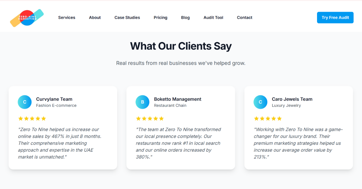
Even the best-designed landing pages fail when users don’t trust what they see. No matter how compelling your offer, skepticism is your biggest competitor.
That’s why incorporating trust signals and social proof is essential for converting cautious visitors into confident buyers.
Quick Stats:
Nearly 95% of consumers read online reviews before making a purchase. (WiserReview)
Here’s how to integrate credibility elements effectively:
- Feature authentic testimonials. Use real names, photos, and company names where possible. Short, specific testimonials outperform long, generic praise.
- Show recognizable logos. If you’ve worked with known brands or have been featured in credible media outlets, display their logos prominently near your CTA or hero section.
- Highlight data or results. “Trusted by 5,000+ businesses” or “98% customer satisfaction rate” are quick credibility boosters. Example: www.ZeroToNineMarketing.com – home page
- Include security badges and certifications. Especially if you collect personal or payment details, SSL icons, trust badges, or privacy statements, build confidence.
- Use video testimonials. A short, authentic video of a customer sharing their experience can outperform any text review in engagement and trust.
Trust is invisible, but its absence is instantly felt. When visitors believe your brand is credible, they stop second-guessing and start converting.
Now, it’s time to ensure your visitors aren’t distracted along the way. Let’s explore how to reduce visual and cognitive clutter so every element on your landing page leads users towards conversion.
Reduce Visual Clutter
Clarity converts. Clutter confuses. One of the fastest ways to increase landing page conversions is by removing everything that doesn’t serve a clear purpose.
A cluttered layout overwhelms visitors, divides attention, and weakens your main message. The human brain loves simplicity. Too many options or distractions lead to paralysis, not action.
Quick Stats:
Users judge a website’s visual appeal in milliseconds. (Google Research)
Therefore, every extra element that doesn’t guide users toward your goal is hurting your results.
Here’s how to simplify effectively:
- Stick to one primary goal. Every landing page should focus on a single conversion objective—whether it’s sign-ups, purchases, or demo requests.
- Limit links and navigation. Remove menu bars, footers, or outbound links that might lead users away from your conversion path.
- Use white space strategically. Breathing room between sections helps direct attention where it matters most—your headline, offer, and CTA.
- Avoid too many visuals or animations. Eye-catching doesn’t mean effective. Use imagery that reinforces your message, not distracts from it.
- Keep your color palette clean. Stick to 2–3 complementary colors and ensure your CTA button visually pops.
Remember, your landing page isn’t a brochure, it’s a conversion machine. Every pixel should have a purpose, and that purpose should be to move the user closer to taking action.
The next step is optimization. Let’s understand how A/B testing and data-driven tweaks help you identify what truly works and scale your results with precision.
Also Read: How To Perform Generative Engine Optimization
Test, Measure & Optimize Continuously (A/B Testing)
What gets measured gets improved. If you’re not testing, you’re guessing, and guessing has no place in conversion optimization.
Even small changes in your landing page elements, like headline wording, button color, or image placement, etc. can lead to major differences in performance. But without data, you’ll never know which version truly works.
Quick Stats:
Marketers who regularly A/B test their landing pages experience a 37% increase in conversions by optimizing elements like headlines, CTAs, and visuals. (Firework)
The best-performing marketers treat optimization as an ongoing process, not a one-time setup.
Here’s how to do it right:
- Run A/B tests consistently. Test one element at a time. Headline, CTA text, image, or layout, so you know what’s driving the difference.
- Track meaningful metrics. Focus on conversion rate, bounce rate, time on page, and form completion rate, not vanity metrics like clicks or impressions.
- Use heatmaps and scroll tracking. Tools like Hotjar or Microsoft Clarity show where users click, scroll, or drop off, giving real insight into user behavior.
- Implement findings gradually. Don’t overhaul everything at once. Small, controlled improvements compound over time.
- Revisit regularly. A landing page that converts today might underperform tomorrow as audience behavior shifts. Keep testing to stay ahead.
Optimization isn’t about changing things for the sake of it. It’s about systematically identifying what works and amplifying it. Continuous testing ensures your landing page evolves alongside your audience, not behind it.
It’s time to look beyond numbers. The next step is all about speed and user experience, because even the best-designed page can fail if it loads too slowly or feels clunky.
Optimize Page Speed & User Experience
A landing page that loads slowly is a landing page that loses money. No matter how persuasive your copy or how compelling your offer, if visitors have to wait, they’ll leave.
Quick Stats:
53% of mobile users abandon a site that takes more than 3 seconds to load.(Google)
Speed isn’t just a technical metric; it’s a conversion driver. When users experience friction like slow loading, clunky navigation, or poor responsiveness, it signals a lack of professionalism and erodes trust.
Conversely, a fast, seamless experience creates confidence and keeps attention where it belongs: on your offer.
Here’s how to ensure your landing page performs flawlessly:
- Compress images and videos. Large media files are the number-one cause of slow load times. Use tools like TinyPNG or WebP format to maintain quality while reducing size.
- Use a reliable hosting provider. A cheap or overloaded server can sabotage performance, especially during high-traffic campaigns.
- Enable caching and content delivery networks (CDNs). This ensures faster access for visitors across different regions.
- Test mobile responsiveness. Over 60% of traffic now comes from mobile, so ensure your design scales cleanly and CTAs are thumb-friendly.
- Minimize plugins and scripts. Unnecessary third-party integrations can drag down speed and cause layout shifts. Use only what’s essential.
A fast, frictionless experience communicates credibility before a single word is read. It tells users, “This brand values my time.” That perception alone can be the difference between a bounce and a conversion.
With speed and usability perfected, there’s just one element left that ties everything together: Personalization.
In the final section, let’s explore how tailoring your landing page to each audience segment can dramatically multiply conversions.
Personalize Your Landing Page Experience
The most effective way to increase landing page conversions today is through personalization. Modern consumers expect experiences tailored to their needs, not one-size-fits-all messaging.
Quick Stats:
Personalized CTAs convert 42% more visitors than generic ones. (Hostinger)
On landing pages, personalization doesn’t mean using someone’s name; it’s about delivering relevance. The more relevant your offer feels, the less friction users experience, and the faster they move from curiosity to action.
Here’s how to personalize effectively:
- Use dynamic text replacement (DTR): Align your headlines with the exact keywords or ad copy that brought users to your page. It builds instant continuity and reduces bounce rates.
- Segment by intent: Create variations of your landing page based on audience type—cold traffic, returning visitors, or remarketing audiences—and match the messaging accordingly.
- Use geolocation and behavior: Adjust copy, pricing, or visuals based on where visitors are located or what they previously viewed. Even small cues like showing local testimonials can enhance trust.
- Integrate smart CTAs: Display different call-to-actions for first-time visitors vs. returning users. For example, “Get Started Free” for new users and “Upgrade Now” for existing leads.
It is necessary to understand that the personalization should feel natural, not intrusive. When done right, it helps users feel seen and understood, increasing their confidence in taking the next step.
With these eight proven hacks in place, your landing page is no longer just a static destination—it’s a high-performance conversion machine.
At ZeroToNineMarketing, we specialize in designing and optimizing landing pages that perform. Our team blends data-backed design, persuasive copywriting, and conversion-focused UX principles, creating pages that attract, engage, and convert with measurable ROI.
Don’t leave money on the table for your competitors.
Contact us today if you are looking to generate leads or driving direct sales.
Now, let’s wrap up our discussion and summarize what you need to do to increase landing page conversions.
Conclusion
Increasing landing page conversions is about precision. Every headline, button, and pixel plays a role in influencing user behavior. When each element is backed by strategy and user psychology, even small adjustments can produce exponential results.
Over time, you’ll not only reduce ad waste but build a landing page system that consistently converts visitors into leads and customers.
When it comes to performance marketing, creativity matters, but conversion is what counts. Start implementing these strategies today and watch every click work harder for your brand.
Frequently Asked Questions
How long should an ideal landing page be for maximum conversions?
The ideal length of a landing page depends on several factors, including your industry, the type of product or service you offer, and your target customer persona. The key is to balance clarity and persuasion without overwhelming the user.
Does using videos on landing pages improve conversions?
Yes, video can significantly boost engagement and conversions, especially when it demonstrates the product, explains a service, or shares customer testimonials. Keep videos short (60–90 seconds) and ensure they auto-play muted or offer clear user control.
Should I focus on desktop or mobile optimization first?
Mobile-first design is now essential since over 60% of web traffic comes from mobile devices. Ensure forms, buttons, and CTAs are thumb-friendly and load quickly. Desktop optimization still matters, but mobile performance directly impacts conversions and search rankings.
Can exit-intent pop-ups help improve conversion rates?
Exit-intent pop-ups can capture abandoning visitors, but they should complements doesn’t replace your main landing page form. Offering a small incentive, like a discount or free resource, can recover leads that might otherwise be lost.
How often should I update or redesign my landing page?
Continuous testing is more effective than frequent full redesigns. Regularly refresh headlines, visuals, and CTAs based on A/B testing results, user behavior, and evolving marketing campaigns. Redesign only when performance consistently underperforms despite incremental optimizations.

